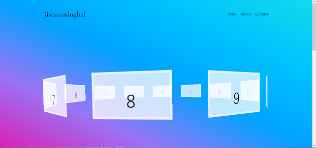
Disappear text animation with html and css in 2022 by jishaansinghal with full source code
Disappear text animation with html and css in 2022 by jishaansinghal with full source code
Html:
<div class="animation">
<span>d</span> <span>i</span> <span>s</span> <span>a</span> <span>p</span> <span>p</span> <span>e</span> <span>a</span> <span>r</span>
</div>
Css:
body {
height:100vh;
font-family: 'Poppins', sans-serif;
font-size:12vw;
text-transform: uppercase;
overflow: hidden;
}
.animation {
position: absolute;
left:0;
right:0;
margin: auto;
width:100%;
text-align: center;
height:fit-content;
bottom:0;
top:0;
}
.animation span {
font-weight: 900;
display: inline-block;
color:transparent;
text-shadow: 0px 0px 0px black;
animation-duration: 3s;
animation-iteration-count: infinite;
}
.animation span:nth-child(1){
animation-name: animationleft;
}
.animation span:nth-child(2){
animation-name: animationleft;
animation-delay: .3s;
}
.animation span:nth-child(3){
animation-name: animationight;
animation-delay: .6s;
}
.animation span:nth-child(4){
animation-name: animationleft;
animation-delay: .8s;
}
.animation span:nth-child(5){
animation-name: animationight;
animation-delay: 1s;
}
.animation span:nth-child(6){
animation-name: animationight;
animation-delay: 1.3s;
}
.animation span:nth-child(7){
animation-name: animationleft;
animation-delay: 1.6s;
}
.animation span:nth-child(8){
animation-name: animationight;
animation-delay: 2s;
}
.animation span:nth-child(9){
animation-name: animationight;
animation-delay: 2.3s;
}
@keyframes animationleft{
50% {transform: skew(50deg) translateY(-200%);
text-shadow: 0px 0px 50px;
opacity: 0;
}
}
@keyframes animationight{
50% {transform: skew(-50deg) translateY(-200%);
text-shadow: 0px 0px 50px;
opacity: 0;
}
}


Comments
Post a Comment