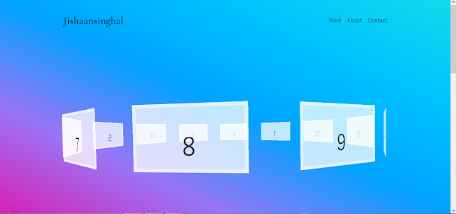
CSS 3d Layered Image Hover Effects CSS Isometric Design in 2022 with Source code | jishaansinghal

<!DOCTYPE html>
<html lang="en">
<head>
<meta charset="UTF-8">
<meta name="viewport" content="width=device-width, initial-scale=1.0">
<title>Document</title>
<style>
body{
margin: 0;
padding: 0;
display: flex;
justify-content: center;
align-items: center;
background: #000;
overflow: hidden;
}
.container{
position: relative;
width: 240px;
height: 400px;
margin-top: 150px;
background:rgba(0, 0, 0, 0.1);
transform: rotate(-30deg) skew(25deg) scale(0.8);
}
.container img{
position: absolute;
width: 100%;
height: 100%;
transition: .5s;
}
.container:hover img:nth-child(4){
transform: translate(160px, -160px);
opacity: 1;
}
.container:hover img:nth-child(3){
transform: translate(120px, -120px);
opacity: .8;
}
.container:hover img:nth-child(2){
transform: translate(80px, -80px);
opacity: .6;
}
.container:hover img:nth-child(1){
transform: translate(40px, -40px);
opacity: .4;
}
</style>
</head>
<body>
<div class="container">
<img src="img.png" alt="img">
<img src="img.png" alt="img">
<img src="img.png" alt="img">
<img src="img.png" alt="img">
</div>
</body>
</html>


Comments
Post a Comment