Posts

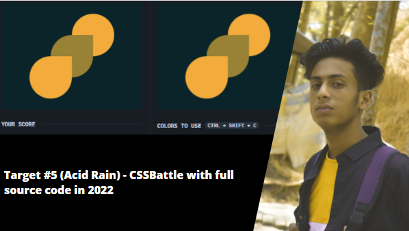
Target #5 (Acid Rain) - CSSBattle with full source code in 2022

Image
Source Code: <div></div> <div> <style> * {   background: #0B2429; } div {   width: 120px;   height: 120px;   margin: 30px 192px;   border-radius: 60px;   background: #F3AC3C; } div:nth-of-type(2) {   margin: -30px 72px;   box-shadow: 60px -60px #998235;   border-radius: 60px 0 60px 60px; } </style>

Advanced Image Animation With HTML & CSS in 2022 with full source code | jishaansinghal

Image
 HTML: <img class="anim" src="Penguins.jpg" alt="img"> CSS: body{ margin: 0; padding: 0; height: 100vh; width: 100%; overflow: hidden; } .anim{ animation: anim 5s ease-out both; } @keyframes anim { 0%{ transform: scale(1.0) translateY(0); transform-origin: 100% 100%; } 100%{ transform: scale(1.3) translateY(-20px); transform-origin: top; } }

CSS 3d Layered Image Hover Effects CSS Isometric Design in 2022 with Source code | jishaansinghal

Image
 <!DOCTYPE html> <html lang="en"> <head> <meta charset="UTF-8"> <meta name="viewport" content="width=device-width, initial-scale=1.0"> <title>Document</title> <style> body{   margin: 0;   padding: 0;   display: flex;   justify-content: center;   align-items: center;   background: #000;   overflow: hidden; } .container{   position: relative;   width: 240px;   height: 400px;   margin-top: 150px;   background:rgba(0, 0, 0, 0.1);   transform: rotate(-30deg) skew(25deg) scale(0.8); } .container img{ position: absolute; width: 100%; height: 100%; transition: .5s; } .container:hover img:nth-child(4){   transform: translate(160px, -160px);   opacity: 1; } .container:hover img:nth-child(3){   transform: translate(120px, -120px);   opacity: .8; } .container:hover img:nth-child(2){   transform: translate(80px, -80px);   opacity: .6; } .container:hover ...

Advanced Button Effects with HTML & CSS in 2022 with full source code | jishaansinghal

 <!DOCTYPE html> <html lang="en"> <head>   <meta charset="UTF-8">   <meta name="viewport" content="width=device-width, initial-scale=1.0">   <title>Document</title> <style> body{   margin: 0;   padding: 0;   box-sizing: border-box;   background: #03045E; } a{   overflow: hidden;   text-decoration: none;   text-transform: uppercase;   font-size: 30px;   list-style-type: none;   border: 2px solid #fff;   padding: 20px 30px;   position: relative;   margin-top: 25%;   margin-left: 40%;   display: inline-block;   color: #fff;   background: #000;   transition: .5s; } a:hover{   background: #fff;   color: #000; } a::before{   content: "";   position: absolute;   top: 0%;   left: -100%;   width: 10%;   height: 100%;   background: #fff;   transition: .5s; } a:hover::before{   left: 100%...

Advanced Card border with html & css in 2022 by jishaansinghal

 <!DOCTYPE html> <html lang="en"> <head>   <meta charset="UTF-8">   <meta name="viewport" content="width=device-width, initial-scale=1.0">   <title>Document</title>   <style> body{ margin: 0; padding: 0; width: 100%; height: 100vh; display: flex; align-items: center; justify-content: center; background: #060c21; } .container .box{ position: relative; width: 200px; height: 300px; background: #060c21; display: flex; justify-content: center; align-items: center; border: 1px solid #000; padding: 15px;   } .container .box::before{   content: "";   position: absolute;   top: -2px;   left: -2px;   bottom: -2px;   right: -2px;   background: #fff;   transform: skew(2deg,2deg);   z-index:-1; } .container .box::before{   background: linear-gradient(315deg,green, #fff); }   h2,p{     color: #fff;     font-weight: bold;   }   h2 {   ...

Mousemove Eraser Animation with html css and javascript in 2022 source code here | jishaansinghal

Image
  <!DOCTYPE html> <html lang="en"> <head>   <meta charset="UTF-8">   <meta name="viewport" content="width=device-width, initial-scale=1.0">   <title>Document</title>   <style> *{ margin: 0; padding: 0; box-sizing: border-box; } body{   width: 100%;   height: 100vh;   background: repeating-linear-gradient(0deg,red 0%, red 50%, green 50%, green 100%),repeating-linear-gradient(90deg,red 0%, red 50%, green 50%, green 100%);   background-size: 30px 30px;   background-blend-mode: difference;   cursor: pointer; } span{   position: absolute;   display: block;   width: 150px;   height: 150px;   border-radius: 50%;   pointer-events: none;   background: url(bg.jpg);   background-size: cover;   background-attachment: fixed; }   </style> </head> <body>      <script> document.addEventListener("mousemove", functi...
Target #4 Ups n Downs CSSBattle in 2022 + full sourece code | jishaansingha

 <div id="a"> <div id="b"> <div id="c"> <style>   * {     background: #62306D;   }   div {     width: 100px;     height: 100px;     background: #F7EC7D;     position: absolute;     border-radius: 0 0 50px 50px;   }   #a {     top: 50px;     left: 150px;     transform: rotate(180deg);   }   #b {     top: 150px;     left: 50px;   }   #c {     top: 150px;     left: 250px;