Posts

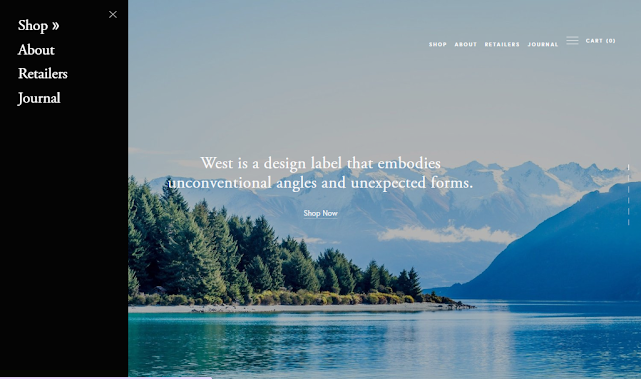
Hamburger Menu Slide Out on Desktop in Squarespace 7 0 website | jishaansinghal

Image
  Hamburger Menu Slide Out on Desktop in Squarespace 7 0 website | jishaansinghal https:// youtu.be/iRr6YkBydIw #squarespace #html #css #js #jquery #website_design #fiverr #fiverrgigpromotion #FiverrGig #fiverrseller #fiverrgigs #fix #squarespacebugs #squarespacefix #bestwebsitedesign

Design,redesign or fix your Squarespace website

  Design,redesign or fix your Squarespace website https:// fiverr.com/share/117wq4 #squarespace #html #css #js #jquery #website_design #fiverr #fiverrgigpromotion #FiverrGig #fiverrseller #fiverrgigs #fix #squarespacebugs #squarespacefix #bestwebsitedesigner #onlinestore #design

I will design redesign or fix your Squarespace website

Image
  I will design redesign or fix your Squarespace website https://www.fiverr.com/share/ALZXeX #squarespace #html #css #js #jquery #website_design #fiverr #fiverrgigpromotion #FiverrGig #fiverrseller #fiverrgigs #fix #squarespacebugs #squarespacefix #bestwebsitedesigner #onlinestore #design

I will design or redesign your Squarespace website

  I will design or redesign your Squarespace website #squarespace #html #css #js #jquery #website_design #fiverr #fiverrgigpromotion #FiverrGig #fiverrseller #fiverrgigs #fix #squarespacebugs #squarespacefix #bestwebsitedesigner #onlinestore https://www.fiverr.com/share/zl1Egv

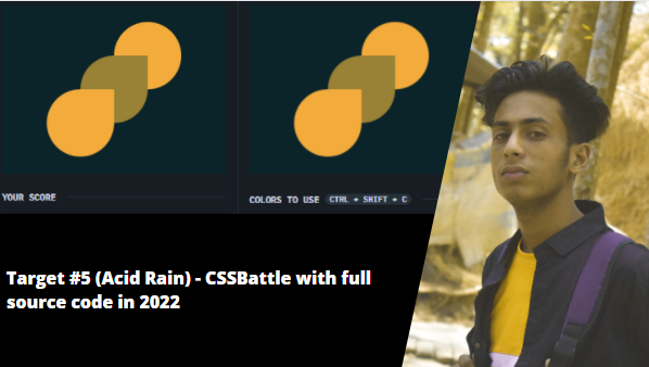
Target #5 (Acid Rain) - CSSBattle with full source code in 2022

Image
Source Code: <div></div> <div> <style> * {   background: #0B2429; } div {   width: 120px;   height: 120px;   margin: 30px 192px;   border-radius: 60px;   background: #F3AC3C; } div:nth-of-type(2) {   margin: -30px 72px;   box-shadow: 60px -60px #998235;   border-radius: 60px 0 60px 60px; } </style>

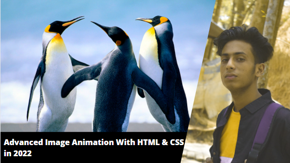
Advanced Image Animation With HTML & CSS in 2022 with full source code | jishaansinghal

Image
 HTML: <img class="anim" src="Penguins.jpg" alt="img"> CSS: body{ margin: 0; padding: 0; height: 100vh; width: 100%; overflow: hidden; } .anim{ animation: anim 5s ease-out both; } @keyframes anim { 0%{ transform: scale(1.0) translateY(0); transform-origin: 100% 100%; } 100%{ transform: scale(1.3) translateY(-20px); transform-origin: top; } }

CSS 3d Layered Image Hover Effects CSS Isometric Design in 2022 with Source code | jishaansinghal

Image
 <!DOCTYPE html> <html lang="en"> <head> <meta charset="UTF-8"> <meta name="viewport" content="width=device-width, initial-scale=1.0"> <title>Document</title> <style> body{   margin: 0;   padding: 0;   display: flex;   justify-content: center;   align-items: center;   background: #000;   overflow: hidden; } .container{   position: relative;   width: 240px;   height: 400px;   margin-top: 150px;   background:rgba(0, 0, 0, 0.1);   transform: rotate(-30deg) skew(25deg) scale(0.8); } .container img{ position: absolute; width: 100%; height: 100%; transition: .5s; } .container:hover img:nth-child(4){   transform: translate(160px, -160px);   opacity: 1; } .container:hover img:nth-child(3){   transform: translate(120px, -120px);   opacity: .8; } .container:hover img:nth-child(2){   transform: translate(80px, -80px);   opacity: .6; } .container:hover ...